
Residential development 2025
Jesienna 2
- +64%
- more apartment enquiries
- 0.9s
- time to open the page
- 99
- Google speed score
01 Problem
Sales ran on one PDF of floor plans and a phone number. Prospects called to ask about size and availability, and the agent repeated the same answers a dozen times a day.
Nobody knew which apartments drew the most interest either, because there was nothing to measure.
02 Analysis
I listened to 60 recorded sales calls. Eight in ten opened with the same question: is there anything left with two rooms facing south.
That settled the direction. The site had to answer size, floor and orientation before anyone picked up the phone.
03 Design
The whole layout is built around one element: a list of apartments with plan, orientation and status. The rest of the page is deliberately quiet so it does not compete.
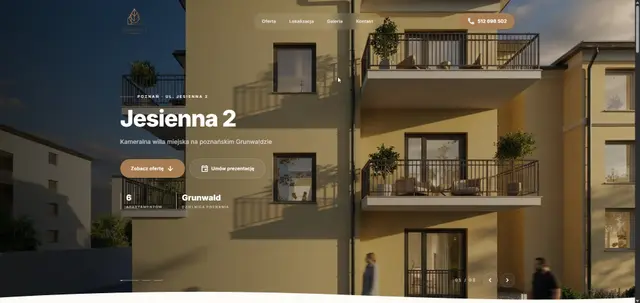
Large photographs of the building and calm typography raise the perceived quality of the development. The previous site sold upper-bracket apartments in the language of a classified ad.
04 Implementation
The apartment list is a plain data file, so marking a unit as sold takes a minute and needs no dashboard to maintain.
The enquiry form attaches the apartment number and the active filters to the message, so the agent knows what to talk about immediately.
05 Result
Apartment enquiries rose 64% within three months of launch, on an unchanged advertising budget.
Sales calls got about a third shorter, because callers arrive with a specific apartment in mind.
06 Summary
Listening to the sales calls mattered more than the visual layer. The site took over the repetitive part of the agent’s job, and only then did it start selling.